


ABOUT
Hello, I'm Alina, a graphic designer & illustrator.
I believe that good design can make the world a better place. I enjoy designing with attention to detail and discovering new ideas through the process of creating. With colorful brainstorm sessions and concentrated thought, my ambition as a designer is to connect with others through my work in a positive way.
My specialization is in branding, user experience, and writing. I’m passionate about developing design solutions that support meaningful ethics-driven work and community development initiatives.
In addition to graphic design, I also love working on my personal art projects using various mediums including digital, acrylics, watercolor, and graphite. These projects draw inspiration from the natural world, diverse global cultures, poetry, and the intricate beauty of Islamic art.
My specialization is in branding, user experience, and writing. I’m passionate about developing design solutions that support meaningful ethics-driven work and community development initiatives.
In addition to graphic design, I also love working on my personal art projects using various mediums including digital, acrylics, watercolor, and graphite. These projects draw inspiration from the natural world, diverse global cultures, poetry, and the intricate beauty of Islamic art.
WORK


Case studies

ZSM Recruiting Responsive Website & Branding
Primary Role: Brand Strategy, UI/UX Design | 2025
Responsive website for an independent finance recruitment firm. The goal was to build a clean, intuitive interface that clearly communicates the firm's expertise and provides easy-to-fill interest forms for users.
PROBLEM STATEMENT
The challenge was to design a website that meets the needs of both clients and candidates while positioning the firm competitively within a highly saturated recruitment market.
DESIGN OBJECTIVES
Design a minimalistic, responsive website that prioritizes usability, integrates the firm’s branding, and strengthens the firm’s digital presence.
Responsive website for an independent finance recruitment firm. The goal was to build a clean, intuitive interface that clearly communicates the firm's expertise and provides easy-to-fill interest forms for users.
PROBLEM STATEMENT
The challenge was to design a website that meets the needs of both clients and candidates while positioning the firm competitively within a highly saturated recruitment market.
DESIGN OBJECTIVES
Design a minimalistic, responsive website that prioritizes usability, integrates the firm’s branding, and strengthens the firm’s digital presence.
Primary Role: Brand Strategy, UI/UX Design | 2025
Responsive website for an independent finance recruitment firm. The goal was to build a clean, intuitive interface that clearly communicates the firm's expertise and provides easy-to-fill interest forms for users.
PROBLEM STATEMENT
The challenge was to design a website that meets the needs of both clients and candidates while positioning the firm competitively within a highly saturated recruitment market.
DESIGN OBJECTIVES
Design a minimalistic, responsive website that prioritizes usability, integrates the firm’s branding, and strengthens the firm’s digital presence.
Responsive website for an independent finance recruitment firm. The goal was to build a clean, intuitive interface that clearly communicates the firm's expertise and provides easy-to-fill interest forms for users.
PROBLEM STATEMENT
The challenge was to design a website that meets the needs of both clients and candidates while positioning the firm competitively within a highly saturated recruitment market.
DESIGN OBJECTIVES
Design a minimalistic, responsive website that prioritizes usability, integrates the firm’s branding, and strengthens the firm’s digital presence.

Structure to Design Execution
Through structure and early design, the site layout was defined around key user tasks that prioritize functionality and efficiency.
USER RESEARCH & INSIGHTS
Research and analysis showed the recruitment market was highly competitive, with many sites visually busy, creating an opportunity for a clean, minimal design. User workflows highlighted the need for simplified forms and intuitive, responsive navigation, especially for mobile job seekers. Insights also revealed that branding should be carefully aligned to resonate with the corporate finance audience, ensuring the firm connects with the right clients and candidates.
USER RESEARCH & INSIGHTS
Research and analysis showed the recruitment market was highly competitive, with many sites visually busy, creating an opportunity for a clean, minimal design. User workflows highlighted the need for simplified forms and intuitive, responsive navigation, especially for mobile job seekers. Insights also revealed that branding should be carefully aligned to resonate with the corporate finance audience, ensuring the firm connects with the right clients and candidates.
Through structure and early design, the site layout was defined around key user tasks that prioritize functionality and efficiency.
USER RESEARCH & INSIGHTS
Research and analysis showed the recruitment market was highly competitive, with many sites visually busy, creating an opportunity for a clean, minimal design. User workflows highlighted the need for simplified forms and intuitive, responsive navigation, especially for mobile job seekers. Insights also revealed that branding should be carefully aligned to resonate with the corporate finance audience, ensuring the firm connects with the right clients and candidates.
USER RESEARCH & INSIGHTS
Research and analysis showed the recruitment market was highly competitive, with many sites visually busy, creating an opportunity for a clean, minimal design. User workflows highlighted the need for simplified forms and intuitive, responsive navigation, especially for mobile job seekers. Insights also revealed that branding should be carefully aligned to resonate with the corporate finance audience, ensuring the firm connects with the right clients and candidates.

Branding + Experience
The brand is expressed through bold, professional, and approachable tones. Thoughtful color contrast guides users while reinforcing a cohesive visual identity.
The brand is expressed through bold, professional, and approachable tones. Thoughtful color contrast guides users while reinforcing a cohesive visual identity.

Impact & Key Takeaways
Users want convenience and straightforward digital platforms. In this study, I created a mobile-friendly website that offers clients and candidates an easy way to engage with the firm. The clear, intuitive interface serves multiple audiences while consistently expressing the firm's brand across the site and key user journeys.
Users want convenience and straightforward digital platforms. In this study, I created a mobile-friendly website that offers clients and candidates an easy way to engage with the firm. The clear, intuitive interface serves multiple audiences while consistently expressing the firm's brand across the site and key user journeys.
Early research helps to establish user needs and goals.
Iteration can provide refinement to user flows and accessibility.
A cohesive brand and website strengthen credibility in a competitive market.
Clear structure and messaging support efficient user journeys.
Early alignment between brand and UX creates a strong, scalable foundation.
Iteration can provide refinement to user flows and accessibility.
A cohesive brand and website strengthen credibility in a competitive market.
Clear structure and messaging support efficient user journeys.
Early alignment between brand and UX creates a strong, scalable foundation.
Early research helps to establish user needs and goals.
Iteration can provide refinement to user flows and accessibility.
A cohesive brand and website strengthen
credibility in a competitive market.
Clear structure and messaging support
efficient user journeys.
Early alignment between brand and UX creates
a strong, scalable foundation.
Iteration can provide refinement to user flows and accessibility.
A cohesive brand and website strengthen
credibility in a competitive market.
Clear structure and messaging support
efficient user journeys.
Early alignment between brand and UX creates
a strong, scalable foundation.
Early research helps to establish user needs and goals.
Iteration can provide refinement to user flows and accessibility.
A cohesive brand and website strengthen credibility in a competitive market.
Clear structure and messaging support efficient user journeys.
Early alignment between brand and UX creates a strong, scalable foundation.
Iteration can provide refinement to user flows and accessibility.
A cohesive brand and website strengthen credibility in a competitive market.
Clear structure and messaging support efficient user journeys.
Early alignment between brand and UX creates a strong, scalable foundation.
FamilyCare App UX Design Study
Primary Role: UI/UX Design, User Research | 2026
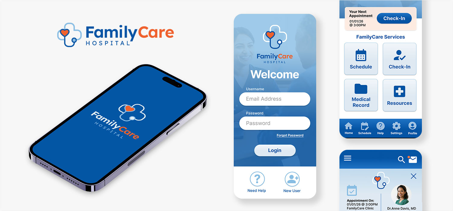
The FamilyCare app is a project developed as part of Google's UX Design certification. The goal of the app is to provide a quick and easy way for patients to check in and fill out the health screening for their doctor's appointment.
Over the course of 6 months, my responsibilities in the design study included conducting interviews, generating paper and digital wireframes, creating low-fidelity and high-fidelity prototypes, conducting usability studies, accounting for accessibility, iterating on designs, and testing.
PROBLEM STATEMENT
Patients find the long lines and paperwork at the doctor’s office time-consuming and frustrating. In their busy schedules, they want to be able to check in quickly without having to wait.
DESIGN OBJECTIVES
Design a user-friendly app that is intuitive, easy to navigate, and accessible for patients. The app should reduce the time patients spend during the check-in process for their doctor's appointment.
The FamilyCare app is a project developed as part of Google's UX Design certification. The goal of the app is to provide a quick and easy way for patients to check in and fill out the health screening for their doctor's appointment.
Over the course of 6 months, my responsibilities in the design study included conducting interviews, generating paper and digital wireframes, creating low-fidelity and high-fidelity prototypes, conducting usability studies, accounting for accessibility, iterating on designs, and testing.
PROBLEM STATEMENT
Patients find the long lines and paperwork at the doctor’s office time-consuming and frustrating. In their busy schedules, they want to be able to check in quickly without having to wait.
DESIGN OBJECTIVES
Design a user-friendly app that is intuitive, easy to navigate, and accessible for patients. The app should reduce the time patients spend during the check-in process for their doctor's appointment.
Primary Role: UI/UX Design, User Research | 2026
The FamilyCare app is a project developed as part of Google's UX Design certification. The goal of the app is to provide a quick and easy way for patients to check in and fill out the health screening for their doctor's appointment.
Over the course of 6 months, my responsibilities in the design study included conducting interviews, generating paper and digital wireframes, creating low-fidelity and high-fidelity prototypes, conducting usability studies, accounting for accessibility, iterating on designs, and testing.
PROBLEM STATEMENT
Patients find the long lines and paperwork at the doctor’s office time-consuming and frustrating. In their busy schedules, they want to be able to check in quickly without having to wait.
DESIGN OBJECTIVES
Design a user-friendly app that is intuitive, easy to navigate, and accessible for patients. The app should reduce the time patients spend during the check-in process for their doctor's appointment.
The FamilyCare app is a project developed as part of Google's UX Design certification. The goal of the app is to provide a quick and easy way for patients to check in and fill out the health screening for their doctor's appointment.
Over the course of 6 months, my responsibilities in the design study included conducting interviews, generating paper and digital wireframes, creating low-fidelity and high-fidelity prototypes, conducting usability studies, accounting for accessibility, iterating on designs, and testing.
PROBLEM STATEMENT
Patients find the long lines and paperwork at the doctor’s office time-consuming and frustrating. In their busy schedules, they want to be able to check in quickly without having to wait.
DESIGN OBJECTIVES
Design a user-friendly app that is intuitive, easy to navigate, and accessible for patients. The app should reduce the time patients spend during the check-in process for their doctor's appointment.
Research Methodology & Process
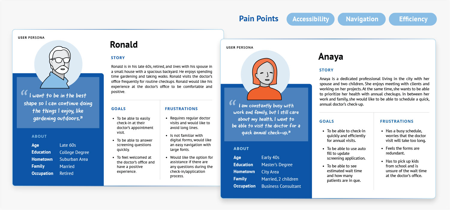
For this project, I gathered research and data by conducting user surveys and a competitive audit. I recruited 5 participants from different age groups to understand what their pain points were when they checked in for their doctor's visits.
USER PERSONAS
Through early research, user personas were created and their journey was mapped out. Pain points indicated the need for a clear navigation and easy-to-read form.
KEY FINDINGS
The competitive audit showed that competitor apps had informative content and options for various hospital services. However, competitors lacked clean interfaces and readable text that is easy to view for older patients and individuals with disabilities. Patients can benefit from more accessibility options, navigation that flows easily between tasks, and clean layouts focused on patients' needs.
USER PERSONAS
Through early research, user personas were created and their journey was mapped out. Pain points indicated the need for a clear navigation and easy-to-read form.
KEY FINDINGS
The competitive audit showed that competitor apps had informative content and options for various hospital services. However, competitors lacked clean interfaces and readable text that is easy to view for older patients and individuals with disabilities. Patients can benefit from more accessibility options, navigation that flows easily between tasks, and clean layouts focused on patients' needs.
For this project, I gathered research and data by conducting user surveys and a competitive audit. I recruited 5 participants from different age groups to understand what their pain points were when they checked in for their doctor's visits.
USER PERSONAS
Through early research, user personas were created and their journey was mapped out. Pain points indicated the need for a clear navigation and easy-to-read form.
KEY FINDINGS
The competitive audit showed that competitor apps had informative content and options for various hospital services. However, competitors lacked clean interfaces and readable text that is easy to view for older patients and individuals with disabilities. Patients can benefit from more accessibility options, navigation that flows easily between tasks, and clean layouts focused on patients' needs.
USER PERSONAS
Through early research, user personas were created and their journey was mapped out. Pain points indicated the need for a clear navigation and easy-to-read form.
KEY FINDINGS
The competitive audit showed that competitor apps had informative content and options for various hospital services. However, competitors lacked clean interfaces and readable text that is easy to view for older patients and individuals with disabilities. Patients can benefit from more accessibility options, navigation that flows easily between tasks, and clean layouts focused on patients' needs.
Ideation, Wireframes, & Testing
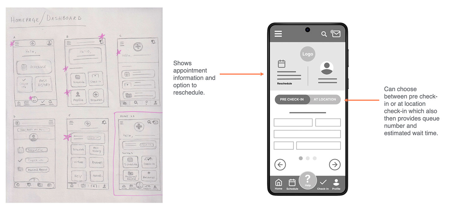
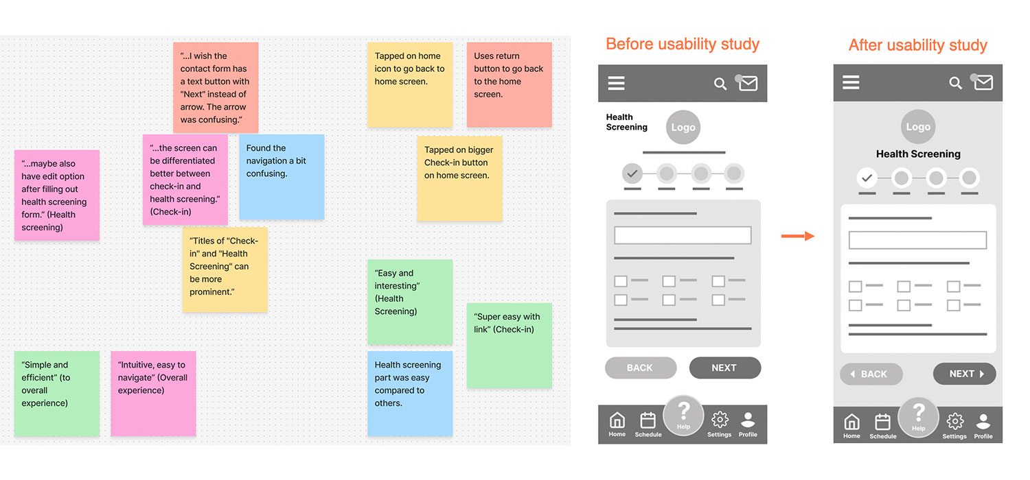
As I continued to iterate and design variations of the screens, I focused on elements that would make the process quick and stand out for intuitive navigation. I prioritized different user needs and a clean interface that would provide the necessary information. The usability study with the low-fidelity prototype further clarified which elements worked and which needed improvement. For example, more contrast was needed to differentiate between the health screening form and the check in screens.
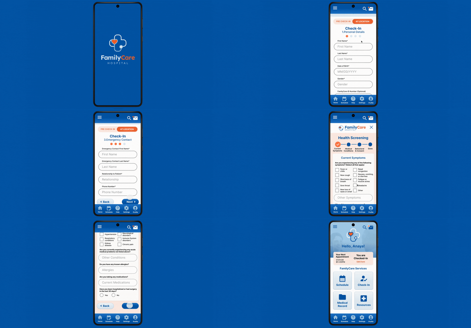
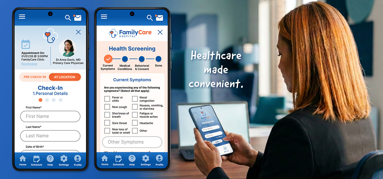
Using the information gathered from the feedback, a high-fidelity prototype was created. The prototype shows the flow of the check-in process. It also incorporates the design system, content, and detailed components.
Using the information gathered from the feedback, a high-fidelity prototype was created. The prototype shows the flow of the check-in process. It also incorporates the design system, content, and detailed components.
As I continued to iterate and design variations of the screens, I focused on elements that would make the process quick and stand out for intuitive navigation. I prioritized different user needs and a clean interface that would provide the necessary information. The usability study with the low-fidelity prototype further clarified which elements worked and which needed improvement. For example, more contrast was needed to differentiate between the health screening form and the check in screens.
Using the information gathered from the feedback, a high-fidelity prototype was created. The prototype shows the flow of the check-in process. It also incorporates the design system, content, and detailed components.
Using the information gathered from the feedback, a high-fidelity prototype was created. The prototype shows the flow of the check-in process. It also incorporates the design system, content, and detailed components.
Research Discoveries & Next Steps
The results show that needs can overlap between different age groups. It was enlightening to gain insight about the pain points users have during their doctor's office check-in process. Usability studies showed that users need clarity, contrast, and simple navigation. Users are more comfortable with what they know, and thus the app should be straightforward without a confusing layout or distracting features.
Next steps would entail another usability study with the high-fidelity mockups. It's important to see how users will interact with the refined design that includes content. The feedback from the study will assist in making the app more accessible, inclusive, and easy to use for all users.
Next steps would entail another usability study with the high-fidelity mockups. It's important to see how users will interact with the refined design that includes content. The feedback from the study will assist in making the app more accessible, inclusive, and easy to use for all users.
The results show that needs can overlap between different age groups. It was enlightening to gain insight about the pain points users have during their doctor's office check-in process. Usability studies showed that users need clarity, contrast, and simple navigation. Users are more comfortable with what they know, and thus the app should be straightforward without a confusing layout or distracting features.
Next steps would entail another usability study with the high-fidelity mockups. It's important to see how users will interact with the refined design that includes content. The feedback from the study will assist in making the app more accessible, inclusive, and easy to use for all users.
Next steps would entail another usability study with the high-fidelity mockups. It's important to see how users will interact with the refined design that includes content. The feedback from the study will assist in making the app more accessible, inclusive, and easy to use for all users.
Users prefer efficiency over an overload of features.
Users want ease and simplicity.
User flows can assist with organization of the information architecture.
User research and user feedback are crucial in designing an inclusive, intuitive product.
Accessibility enhances the experience for all users.
Users want ease and simplicity.
User flows can assist with organization of the information architecture.
User research and user feedback are crucial in designing an inclusive, intuitive product.
Accessibility enhances the experience for all users.
Users prefer efficiency over an overload of features.
Users want ease and simplicity.
User flows can assist with organization of the information architecture.
User research and user feedback are crucial in designing an inclusive, intuitive product.
Accessibility enhances the experience for all users.
Users want ease and simplicity.
User flows can assist with organization of the information architecture.
User research and user feedback are crucial in designing an inclusive, intuitive product.
Accessibility enhances the experience for all users.
Users prefer efficiency over an overload of features.
Users want ease and simplicity.
User flows can assist with organization of the information architecture.
User research and user feedback are crucial in designing an inclusive, intuitive product.
Accessibility enhances the experience for all users.
Users want ease and simplicity.
User flows can assist with organization of the information architecture.
User research and user feedback are crucial in designing an inclusive, intuitive product.
Accessibility enhances the experience for all users.
Copyright © 2026 Alina Nusrat

